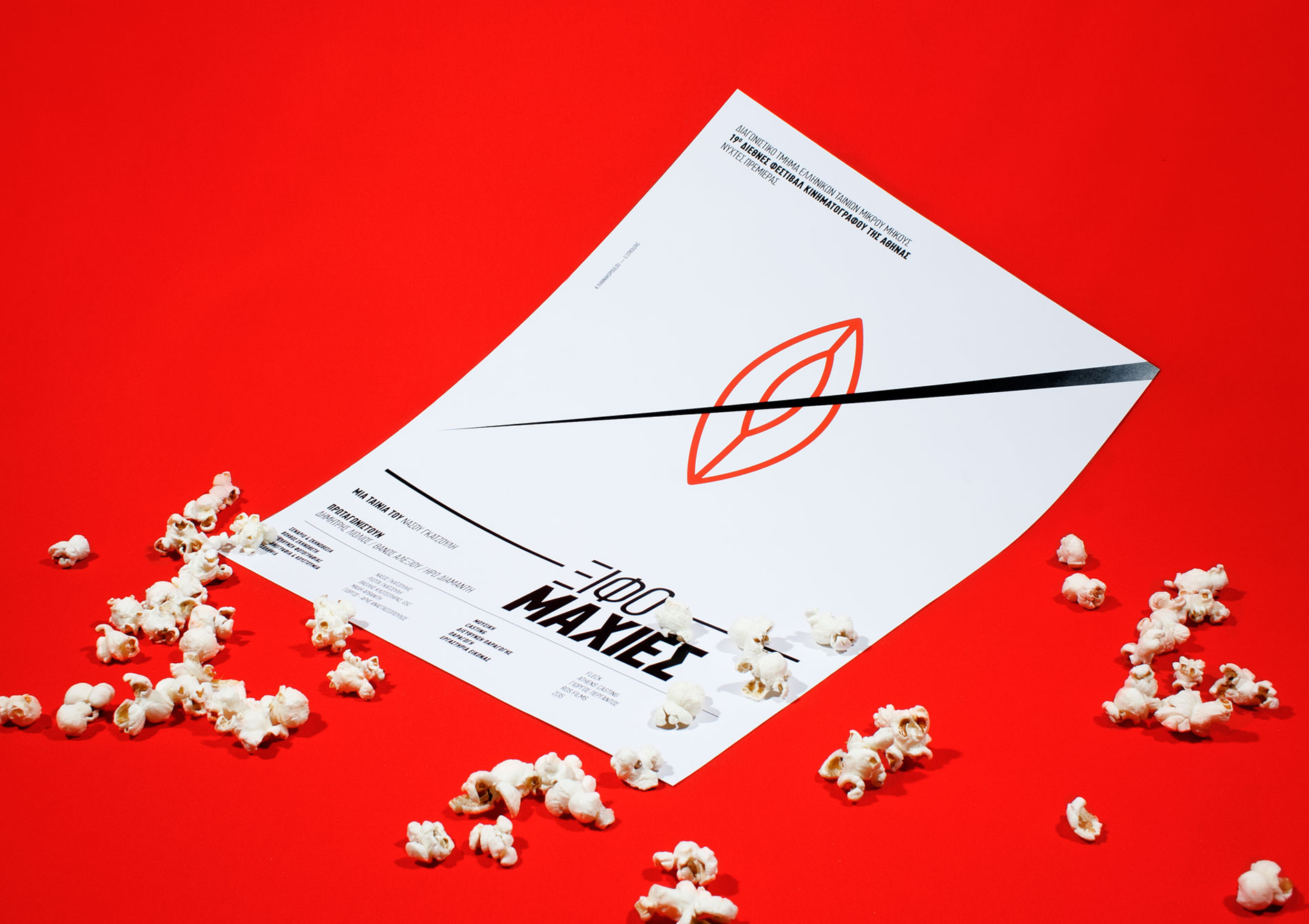
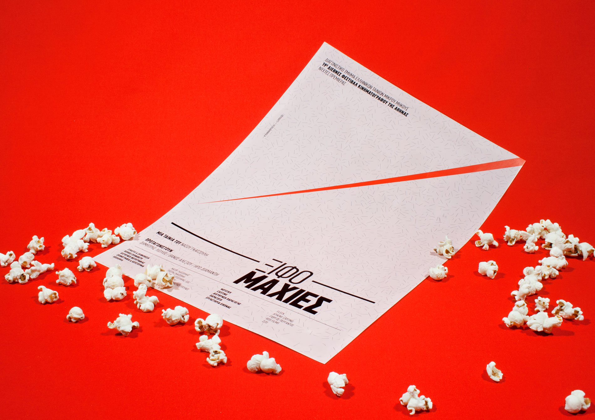
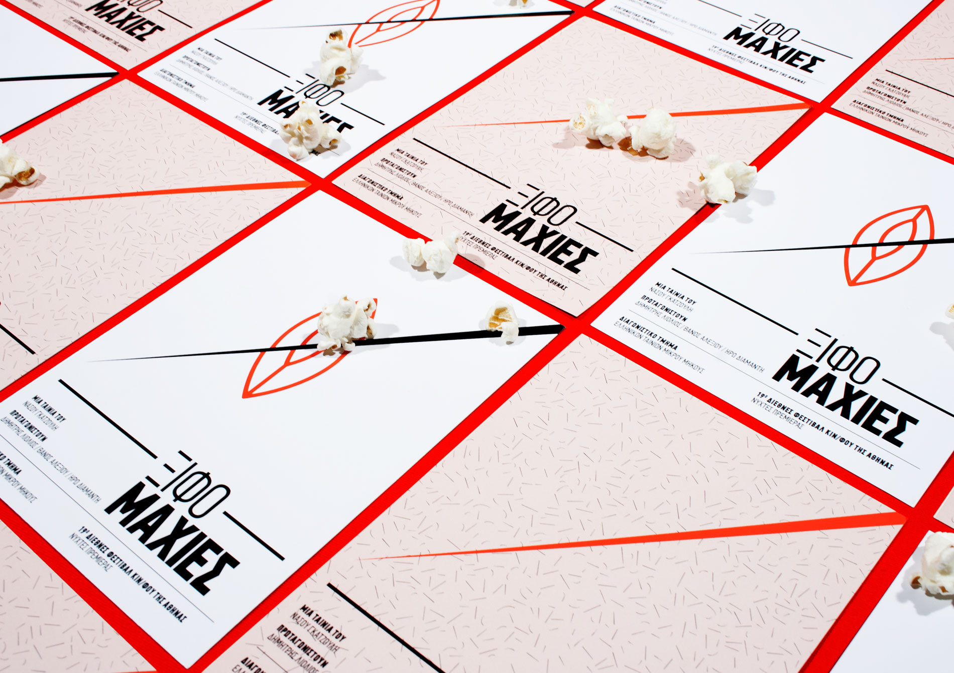
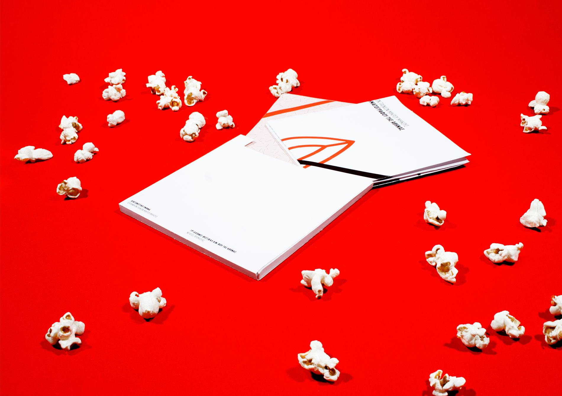
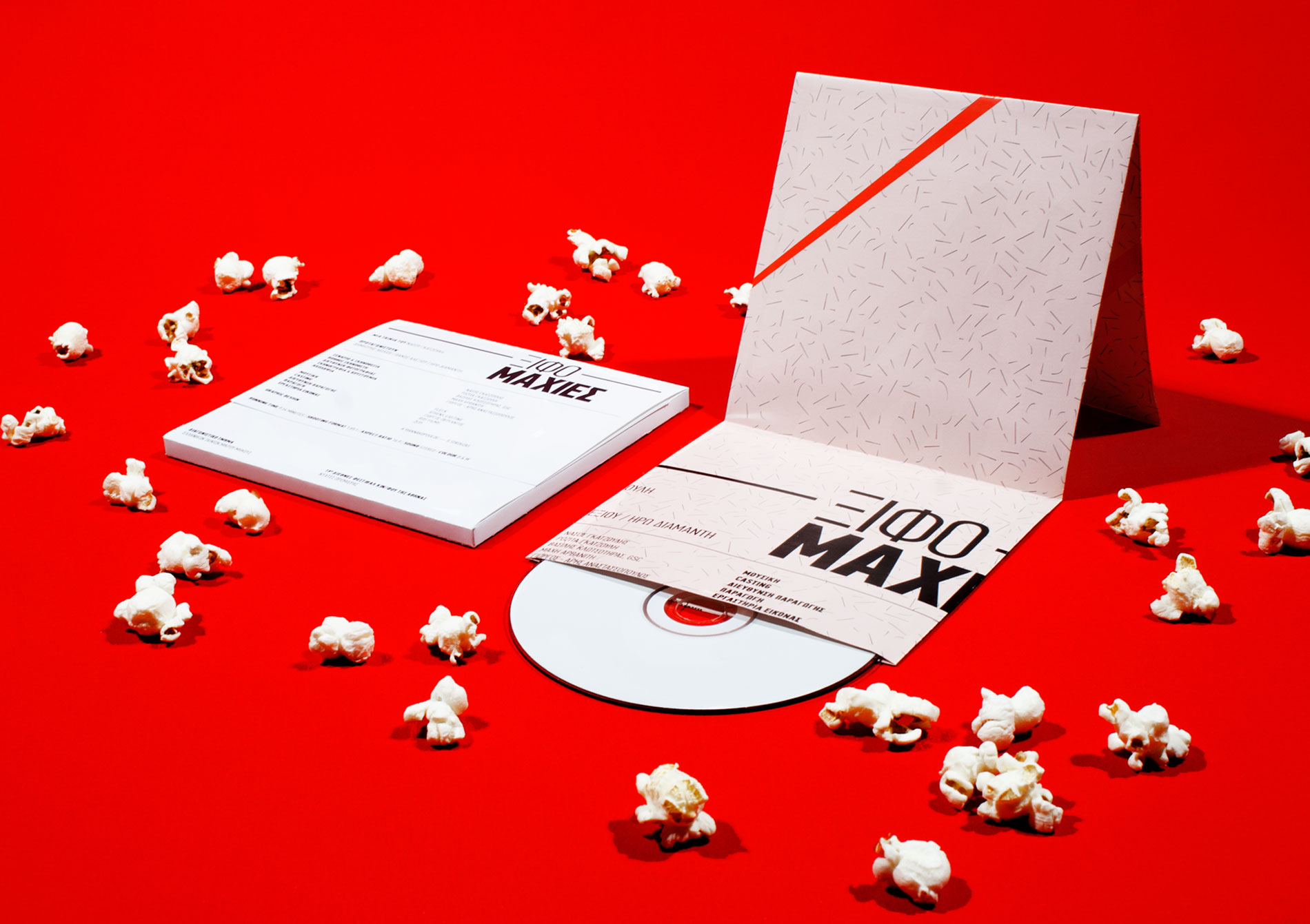
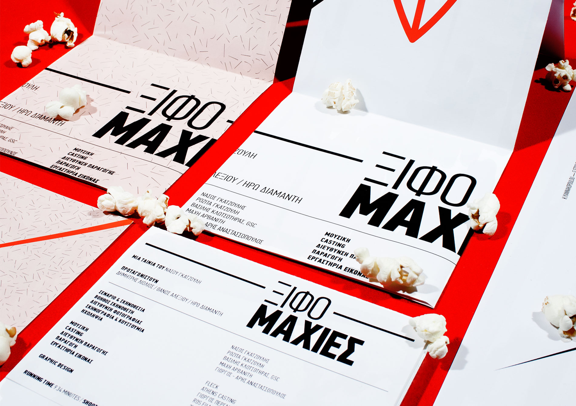
The design of this movie identity was approached in a more semantically and less chatty way, based on the overall feel of the film rather than a snapshot (highlight). The typographic style that is followed is absolute and solid because it works like reflection of the intense dialogues of actors. In order to communicate this basic fact of the movie, two very different weights of the same font are chased for both the title (to look the compound word), and the coefficients info. Typography and sizes of applications are the same on both versions. Except from the basic graphic, we also designed a variant-version (the pink one) which presents far fewer elements of the idea of the film but with a more funny approach, something that characterise the atmosphere of the film.